
Introduction
Histograms are a foundational concept in statistics, offering a visual representation of data distributions. This blog post aims to break down the concept of histograms, with insights and resources from Maths Genie, a popular platform for learning mathematics. Whether you’re just starting or looking to refine your understanding of histograms, this guide will provide clarity on how to read, interpret, and create them.
Histograms are essential for understanding the spread of data, especially when dealing with large datasets. They help to summarize the distribution of numerical data by showing how many data points fall within specified ranges, known as bins. Maths Genie is a resource designed to help students and learners master topics like histograms, providing clear explanations and useful tools.
What is a Histogram?
A histogram is a graphical representation of data that groups numbers into ranges. The x-axis represents these ranges or bins, while the y-axis shows the frequency of data points that fall within each bin. In simple terms, histograms give us a clear visual of how data is distributed across different intervals.
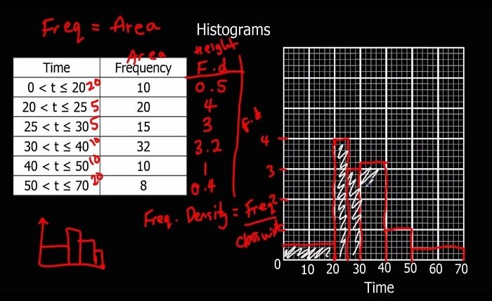
maths genie offers a wide variety of examples and exercises on histograms, which help learners better understand the distribution of data points. For instance, if you’re studying exam scores in a class, a histogram could show how many students scored within certain score ranges, such as 50-60, 60-70, and so on.
Understanding histograms can enhance your ability to interpret data effectively, a skill that is valuable in numerous real-world scenarios, including research, business, and education.
Key Elements of a Histogram
Histograms consist of several crucial components, each serving a specific purpose in helping us interpret data effectively:
- Bins: The range of values grouped together. Choosing appropriate bin sizes is essential for an accurate histogram.
- Frequency: The number of data points that fall within each bin. This is typically represented by the height of the bars.
- X-Axis: Represents the bins or intervals of data.
- Y-Axis: Represents the frequency of data within each bin.
Understanding these elements is key to analyzing histograms. Maths Genie provides learners with tips and tricks to select suitable bin sizes and interpret the frequencies accurately, allowing for clearer analysis.
How to Create a Histogram
Creating a histogram is straightforward once you grasp the key elements. Here’s how to do it:
- Organize Your Data: Start by listing your data points.
- Choose Bin Sizes: Determine the appropriate size for your bins. Too many bins can create a confusing histogram, while too few bins might oversimplify the data.
- Count Data in Each Bin: Calculate how many data points fall into each bin range.
- Draw the Histogram: Plot the bins on the x-axis and the corresponding frequencies on the y-axis. Draw bars that correspond to the frequencies for each bin.
Maths Genie offers step-by-step guides and exercises on how to create histograms, making it an excellent resource for those learning this concept.
Interpreting Histograms: What Do They Tell Us?
Interpreting a histogram can provide a wealth of information about a dataset. Some common insights include:
- Shape of Distribution: Is the distribution of data symmetric, skewed, or bimodal?
- Central Tendency: Where does the majority of the data lie? Is there a concentration around a certain value?
- Spread of Data: How widely is the data spread across the bins?
- Outliers: Are there any unusual spikes or drops in frequency?
By using Maths Genie resources, students can practice interpreting histograms in various contexts, helping them develop a deeper understanding of data distributions.
Common Mistakes When Using Histograms
While histograms are a powerful tool for data analysis, there are common mistakes that learners often make. Understanding these pitfalls can prevent misinterpretation of data:
- Inappropriate Bin Sizes: Choosing bin sizes that are too large or too small can obscure patterns in the data.
- Overlapping Bins: Ensure that bins are distinct, without overlap, for a clear representation.
- Ignoring the Shape of the Distribution: Focusing only on the frequencies can sometimes lead to overlooking important aspects like skewness or symmetry in the distribution.
- Misreading Data Points: Be cautious when counting frequencies, as a slight error can distort the histogram.
Maths Genie highlights these common mistakes and provides strategies to avoid them, ensuring that students can produce accurate histograms.
Advanced Techniques in Histogram Analysis
While basic histograms are useful for visualizing data, there are advanced techniques that can further enhance your analysis. Some of these include:
- Cumulative Histograms: These histograms display the cumulative frequency, showing the total number of data points up to each bin.
- Normalized Histograms: These are useful when comparing data distributions with different sample sizes.
- Logarithmic Scales: In cases of skewed data, a logarithmic scale can help create a more balanced histogram.
By exploring advanced histogram techniques through Maths Genie, you can build on your foundational knowledge and tackle more complex data analysis tasks.
Conclusion
Histograms are a crucial statistical tool that helps in visualizing the distribution of data. Whether you’re just beginning to learn about histograms or looking to refine your skills, platforms like Maths Genie provide the resources you need. Through interactive exercises and step-by-step guides, you can deepen your understanding and apply histogram analysis to various fields, from education to business.
By learning how to create, interpret, and analyze histograms effectively, you’ll develop valuable data analysis skills that will serve you in many areas of life. Take the time to explore Maths Genie, where you’ll find everything you need to master histograms and other essential mathematical concepts.
FAQs
1. What is the difference between a histogram and a bar chart?
While both display data using bars, histograms are used for continuous data, and the bars represent ranges of data (bins), while bar charts are typically for categorical data.
2. How do I choose the right bin size for my histogram?
Choosing the right bin size is crucial for an accurate histogram. A common method is to use Sturges’ formula or experiment with different bin sizes to see which provides the clearest representation of the data.
3. Can histograms be used for non-numeric data?
No, histograms are specifically designed for numerical data. For categorical data, bar charts are more appropriate.
4. What does a bimodal histogram indicate?
A bimodal histogram has two peaks, indicating two different groups or distributions within the data.
5. How can Maths Genie help with histograms?
Maths Genie provides clear explanations, interactive examples, and practice exercises to help learners understand and master histograms, making it an excellent resource for students.